

Fed Watch


Keeping the Economy Stock Market Afloat
The Fed used to attempt to keep the economy afloat, but they haven’t any ammunition left in that regard so it’s all about conflating the economy with the stock market now. Just like Baywatch should’ve been about lifesaving, but in reality it was about looking good on the job (i.e. keeping up appearances).
The Fed’s two day December 2021 meeting has begun and the market is buzzing with expectations about the outcome. Will the Fed accelerate the tapering of their asset purchases (i.e. slow the rate of their quantitative easing)? Will this extend to signaling the potential for raising interest rates as early as 2022 (that’s next year, folks - and it’s only a couple of weeks away), with the objective of curbing elevated inflation? The Fed’s Dot Plot will come under scrutiny, as will any changes in wording.
If you’re interested, there are tools out there that let you review the changes in the wording of Fed statements. You can try this one produced by the Wall Street Journal1.
I’m indifferent to what will happen. I’ll just wait to see what unfolds but, for what it’s worth, I’ve put together a couple of charts that you may find interesting.
I was wanting to align the Fed’s historical asset purchases with the stock market to see if there was any consistent pattern of market behavior when the Fed began tapering their asset purchases. You may have seen a chart like this before, it has done the rounds on multiple occasions.
The Fed’s Balance Sheet compared to the S&P 500 Index
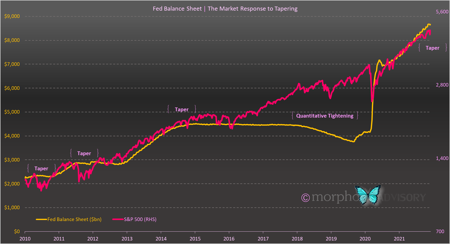
Because I’ve used a log scale on the S&P 500, you can see a bit more volatility in the market price of stocks than other versions of this chart. You can also see that there is a clear increase in market volatility around the time of each tapering by the Fed. However, as is the nature of indices that have experienced substantial growth over time, the significance of historical events can be glossed over because they don’t look particularly large in hindsight.
For this reason, I like to assess financial markets on a drawdown basis. For those not familiar with drawdowns, they are simply a measure in percentage terms of the fall in the market value of a security or index from its All-Time-High.
Here’s the same chart as above, but I’ve replaced the S&P 500 index value with the percentage drawdown.
The Fed’s Balance Sheet compared to S&P 500 drawdowns
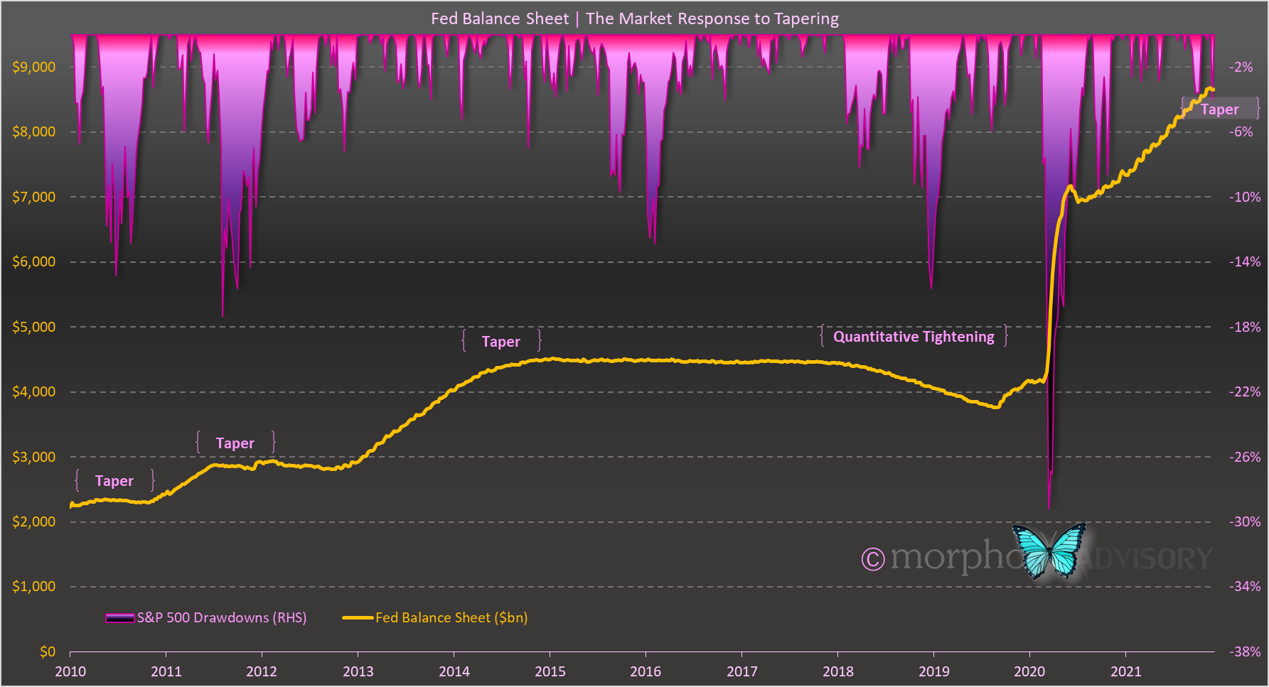
The benefit of the analysis on a drawdown basis is that we see a consistent pattern of the U.S. stock market falling circa 15% when the Fed reduces their asset purchases (or starts to sell some of their assets). There is only one notable exception. The 2014 taper only experienced a couple of smaller 5% drawdowns. I put this down to the fact that the market reaction to that particular taper was experienced, not in the stock market, but in the bond market’s Taper Tantrum of 2013. Ironically, this hit stock markets almost two years later as the rise in bond yields resulted in the bursting of China’s speculative stock market frenzy in mid-2015 (the majority of Chinese tradeable debt securities are issued in USD and was subsequently re-priced at higher interest rates), which fed back into the U.S. market.
Anyhooo, that’s what history is telling us, that the stock market falls up to 15% as a result of the Fed changing their QE policy. Will the U.S. retail investor continue to underwrite the market and change the historical precedent? Will the Fed shock people with their wording or decisions - especially around interest rate hikes? Only time will tell … and we won’t have to wait long.
Irrespective of what happens, you know where I stand. Nothing has changed there. I still see the economy rolling over mid-2022 and markets “should”2 move in fairly close proximity. Certainly, market conditions are increasingly ripe for a slow rollover, which will catch everyone off guard because they are only used to short and sharp sell-offs. Only later on, once this rollover begins (with investor positioning being ripe for a squeeze) will there be an asymmetric interpretation of news - i.e. a catalyst - that will begin the acceleration downwards and that newsworthy event will be later ascribed as the cause.
I used to produce one of these myself for the statements produced by the Reserve Bank of New Zealand when I managed the global fixed income portfolio of an asset management company. All I did was have a copy of the previous version saved in a Word document and, when the new statement came out, I would copy & paste the text into a new Word document and then run Word’s document comparison tool. A quick and effective way to see what had changed and what the Policy Committee had labored over to ensure their message was accurate.
We can’t rule out another anomaly like we experienced in 2020 via the policy response to Covid-19, but I think that is extremely unlikely.