
Indian summer
Repeating cycles but with some of that 'spicy life' variation


Variety is the ‘ethnic food’ of life
We live in a world - a universe - of repeating cycles, yet within those cycles there is latitude for variation. This makes shorter-term prediction more challenging while larger cycles are comparatively easy. We can predict seasons by the passage of the Earth in its annual orbit around the Sun because of the 23.5 degree tilt of the Earth’s axis relative to the orbital plane while simultaneously rotating once on its axis every 24 hours. However, within this framework, we also have a quantum realm of uncertainty and at a more local level, conscious beings with a degree of free will (… whether it’s perceived or real is debatable).
We have come up with terms such as “Indian summer” to describe variations within regular patterns, so subconsciously we acknowledge the existence of uncertainty within well defined patterns. Nevertheless, despite a temporary variance, we hold to the fact that an episode such as an ‘Indian summer’ will revert to the larger pattern, and winter will arrive.
Markets are no different. They are subject to cycles, but to paraphrase George Orwell, “some cycles are more equal than others”.
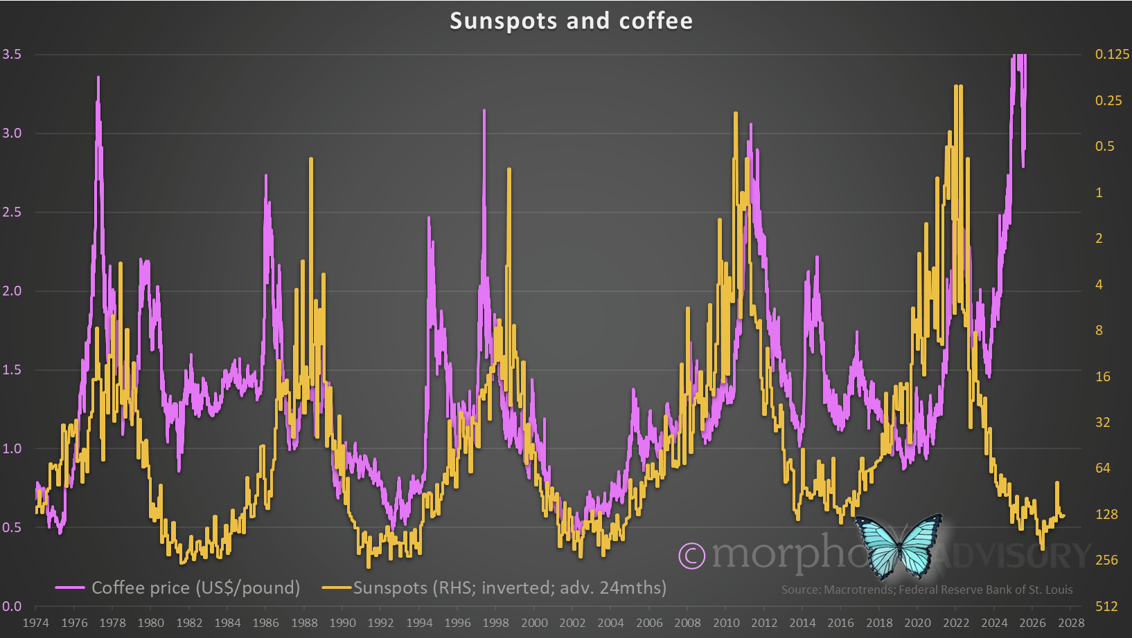
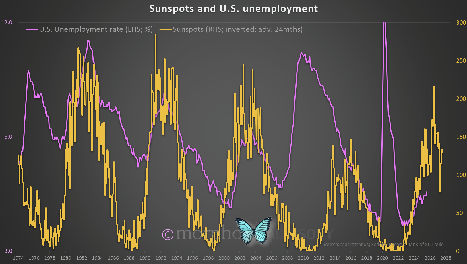
Take the price of coffee as an example. When we zoom out, we can see a pattern of a peak in the coffee price and then again 3-years (+/-) later, a second peak. We can then add the U.S. unemployment rate and advance it 2-years and find that the first peak in the coffee price aligns (more or less) with the peak in the advanced unemployment rate.

The current peak in the coffee price is 3-years after the first, so that pattern is holding. But the scale of the move is quite literally “off the chart” whereas previous moves have been broadly commensurate in magnitude with the change in the unemployment rate (using the scales applied in the above chart).
The double price peak 3-years apart in coffee is an interesting phenomenon though, and would suggest a trend reversion to lower prices over coming years (because the current peak is the second in the sequence).
Coffee is grown for human consumption and like all soft commodities, is subject to weather and other such factors that can cause bad seasons for growth and therefore higher prices. At these prices, there will be significant investment in coffee production (e.g. land purchases, new planting etc.) to profit from such high prices … which will ultimately lead to lower coffee prices as a global oversupply of the roastable bean will ensue.
Maybe there is a direct relationship between coffee prices and the U.S. unemployment rate or maybe it is a simple correlation, and one that works for a few decades then doesn’t? I don’t know.
Maybe the coffee price and the U.S. unemployment rate are both subject to other influences greater than either?
If I align the coffee price with sunspot activity (advancing the number of sunspots by 24 months), there is a very broad match to peak price cycles. Please bear in mind I’m talking on a planetary scale now and not a business cycle.
If a coffee plant’s growth cycle (or any plant on Earth, for that matter) is influenced by solar activity (albeit delayed), then would that also impact the behavior of other life forms?
If it does, then conscious beings such as humans and their ability to exercise free will can get out of sync with celestial cycles, just as the creation of the light bulb enabled us to break the effect of circadian cycles (not always for the better). But as those infomercials are always warning, “only for a limited time”.
Insights from my back catalogue
Ten months ago I published a new trading indicator after I upgraded a subscription that gave me access to financial data and enabled me to code some algorithms. My first play in this sandbox produced a pretty good system.
I was unable to amalgamate the Buy and Sell signals into a single indicator (likely due to a lack of coding talent but mostly a lack inclination - I was only playing, after all). I simply created one indicator for each of the Buy and the Sell signal. The following chart is the Buy signal, which turned out to be scalable as I changed the periodicity of the chart.
You can see that (using a Daily chart) it caught April’s “Liberation Day” Buy opportunity beautifully. It also works wonderfully on multi-day, Weekly, and Monthly periodicity.
However, the Sell signal only worked on large scale time frames. I suppose that this is an ideal scenario because you want to stay invested as long as possible and only miss the largest sell-offs. It captured the sell-offs of 1929; 1987; 2000; 2022, and even Liberation Day, plus a couple of other episodes, but also had one false signal in the late 1950’s.
Let’s have a look at what it’s saying now.