


The Fed's Employment Paradox
Why they gonna zig when they shoulda zagged

This article continues and elaborates upon my thinking from an earlier post, but with some saucy new charts because I know what you like.
Employment data has been posting strong positive numbers in the recovery from the short but sharp COVID-19 recession. Job Openings (JOLTS) data is showing 10 million jobs still up for grabs at the same time that the Unemployment rate has fallen back to a historically respectable level circa 5%.
Employment data is important to the U.S. Federal Reserve because maximum stable employment is one aspect of their dual mandate (the other being price stability). This is why the Fed is looking at employment data as being key to determining whether they continue their bond purchasing (QE) activity to the degree they have been.
Both JOLTS and Unemployment data will continue to appear strong. There will be plenty of jobs available and the unemployment rate will continue to fall. The Fed will be encouraged. They will be so encouraged that they will do something stupid. To be fair, they’re in a position (mostly of their own making) that they are damned if they do, damned if they don’t. Nevertheless … *shrug*
In my earlier post I illustrated the close relationship between Job Openings and the Unemployment rate. I also explained that I didn’t think the strong headline employment data meant a strong economy. I stand by that analysis. After some further thinking and digging into some data I managed to produce the following chart.

The chart compares JOLTS (job openings) with QUITS (people leaving jobs because they’ve got a better one to go to). Historically, the two move in tandem - understandably. However, what has begun to happen recently is that while the JOLTS have shot ahead, the QUITS have stalled creating a significant disparity. What gives?
A sort of “I’m too old for this shit!” malaise has once again permeated the workforce. You see, the first of the Baby Boomer generation (Boomers) reached retirement age at the time of the GFC. But Boomers are workers, so many stayed on beyond traditional retirement age and have needed to be shaken out of the workforce through economic crisis. Now, one decade later, a second economic shakeout has occurred. This COVID-19 induced shakeout came with stimmy. Perhaps that’s all some post-retirement age Boomers needed. They experienced the freedom of being paid not to work and maybe they got a taste for it? So that’s what is going on. The workforce is shrinking, which has the impact of making employment data look strong because many who are leaving are past retirement age so don’t count for unemployment statistics.
The following chart shows that over many decades there was big jump in the proportion of the population that was of employable age. A population bubble - pig in a python etc.
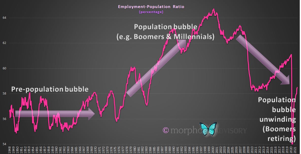
Here’s the same chart, but comparing the Employment-Population ratio with the Unemployment rate, which highlights that when there is a large proportion of the population that is of employable age, the unemployment rate is typically higher on average and vice-versa.

The above chart illustrates our thesis that the unemployment rate will encourage the Fed to believe that the economy is strong. The unemployment rate will achieve lows that haven’t been seen for some 70 years. This will not be due to a strong economy. It will be because of a shrinking working age population.
I have noted before that I have observed a relationship between economic growth and the growth in the working age population. For every 1% growth in the working age population there is approximately 5% growth in GDP, as the following chart demonstrates.

This is a causal relationship and not correlative. The reason that I say this is causal is because working age population captures those aged between 16 and 64 (inclusive). In order to join that cohort one would have to be born 16 years earlier, and conceived some 9 months prior to that. It would be pretty far-fetched to say that the collective sexual activities of a nation from 16 years and 9 months earlier simply consistently correlates to GDP. Organic growth is organic growth.
During the population bubble of the second-half of the last century, the growth rate of the working age population averaged around 1.25% per annum. If we add our 5x multiplier (which equates to adding 5%, more or less) to the Employment-Population ratio growth rate and compare it to GDP growth, we see the close relationship. Moreover, we see that GDP growth was strongest relative to the Employment-Population growth rate during the height of the population bubble’s expansion. Now that the bubble is deflating, GDP growth is comparatively weak.

Measuring the difference between these two growth rates emphasizes the variance, which the chart below shows. As the population bubble further unwinds over the coming decade(s), we can expect GDP growth to struggle. If you thought the economy since the GFC was challenged, you ain’t seen nothing yet.

The variance between the Employment-Population ratio growth rate (plus 5%) and GDP growth also confirms another point where I am at odds with the established and predominant thinking of most major institutions, economists and market strategists. Namely, I firmly believe that the inflation we have recently experienced is transitory. Sure, it’s been large and sharp, but transitory refers to time and not scale - a point that some supposedly intelligent people don’t understand … but I digress.
The variance between the Employment-Population ratio growth rate (plus 5%) and GDP growth - which I say is going to experience some chunky negative numbers over the coming decade(s) - strongly correlates to year-over-year inflation.

So, the Fed thinks the economy is moving in the right direction because they are observing strong headline employment data. They are wrong.
Economic activity has been strong coming out of the COVID-19 recession, which most think is a return to normal - i.e. the world getting back to trend. This is a false dawn.
Whether the Fed tapers its QE or not, the economy is positioned for long-term stagnation (a-la Japan and Europe) and markets are set up for some form of shock. The world will be blind-sided as they continue to misinterpret base effects and supply problems plus a shrinking employable population as a strong economy. It could be sudden or it could be a long, slow slide. Either way, it’s happening.
Staying focused on macro themes can be difficult when there is plenty of noise produced on a daily basis and FOMO niggles at you with each hearing of stories of quickly gained wealth from this cycle’s miracle investment(s). Picking that miracle investment in each cycle is near impossible. Picking a winning strategy for every cycle is not, but it does require insight, patience and discipline.
Let’s be careful out there